The Formal Elements
We were asked to look carefully at this image in class. It was taken by one of the pioneers of photography. It is unlike many of the images created by photographers at the time. It is quite stark and full of contrasts:
In focus Smooth
Light Out of focus
Close-up Dark
Vertical Distant
Smooth Horizontal
Out of focus Textured
In focus Smooth
Light Out of focus
Close-up Dark
Vertical Distant
Smooth Horizontal
Out of focus Textured
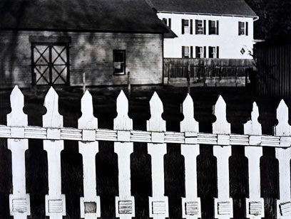
The White Fence
|
(For Paul Strand's photograph 'White Fence')
Particularizing "White Fence" beyond which the seeming eehoes of barn, house, bright light flat on foursquare far building while in closer view shades darken the faint ground. Yet fence as image or word, white or black, or where place the person, the absent, in this ring of focus? I come closer, see in there the wistful security, all in apparent place, the resonant design, diamond, the dark/light, the way all plays to pattern, the longed for world of common facts, Then this fence again, as if pasted on, pushes out and across, a static, determined progress of detailing edges, American, an odd reasons so forced to be seen. It cannot accommodate, cannot let get past unaffected, any, must be "White Fence". - By Robert Creeley |
|
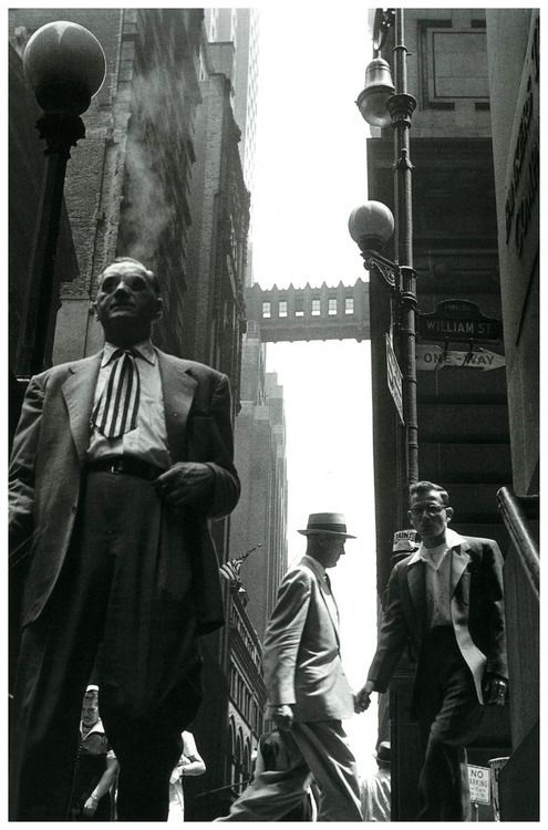
Leonard Freed - New York City, 1954As you can see in this image there is a strict rule of thirds, if you were to put grids on the image you would be able to see that there are a man in each section. This helps to breakdown the image so when viewing it you can see all of the detail clearly. With this in mind there are also a lot of different things to focus on, you have the bridge/walkway right in the middle of the picture, but in the foreground you have 3 different men who have contrast between them as two of them are in black and one of them is in white. The positioning and depth of the men make them look bigger/smaller. There is also a one way sign. I think that this could mean that there is only one way in western society, meaning that you have to conform. When looking at all the men they are all dressed in suits and supposively all look the same, this could support the idea of conformity.
In the picture there is a lot of contrast going on between the brighter and darker colours, these colours kind of brighten as the image ascends, with the darkest at the bottom and the brightest at the top. This gives a sense of depth and height to the image that theres a huge shadow going over the image. These shades and shadows remove some of the detail and texture to the buildings. This effect is also made by the image having a low viewpoint. |
|
