Image set
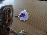
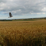
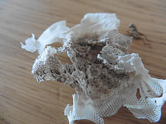
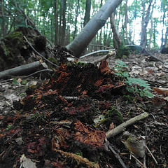
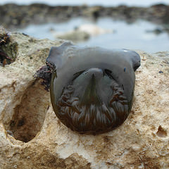
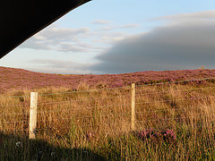
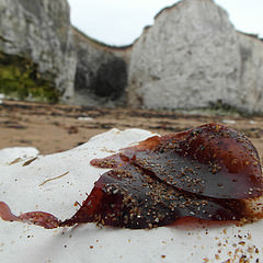
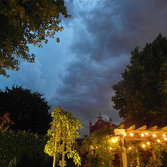
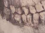
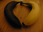
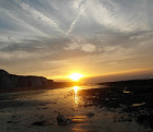
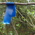
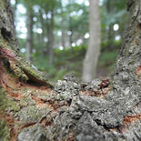
These are a set of images that I took to show contrast in different ways, my main focus was to show the contrast between life and death. I have also taken contrast between colour and other various aspects. None of these images were edited, they are uploaded how they came, I felt like adding any effects to my images would ruin the whole point to them. Many of them are of natural things and editing them would take away the natural and organic feel, and make it more modern and man made. My task was to take a set of 30 images showing contras; first of all I started to find contrast around the house keeping on the topic of Life and Death. After taking as many as I thought was appropriate and that I thought was a good photo, I then decided to take my camera to Kingsgate bay. There were many different images that I took and I had to select the ones that I thought were my best.
|
|

|
|
|
My Top 5 Images
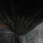
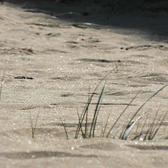
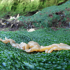
I felt like these images were my top 5 because they are clear pictures and I feel that they show clearly the effect and purpose to the images. For example in this image of the seaweed type thing in focus you can see the contrast between the texture of the leaves against the texture of the sand grains. They are completely different and you can almost feel it. As there are the cliffs in the background you can get a sense of depth to the image, with the comparison between the small leaf and the small grains of sand, in contrast to the huge cliffs.
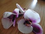
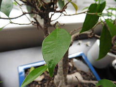
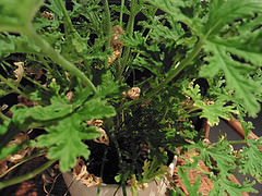
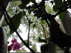
I like the 4th image in particular because of the blur that’s in the image. There is a focus onto one of the leaves while the rest of the bonsai tree is blurred. I think the effect of this makes the viewer curious to what the other leaves look like. For example if the tree has been badly cared for and all of the other leaves are brown and dying out, however the main focus is on the one leaf that’s not got to that stage yet, and still looks fresh and healthy. This makes you think about the contrast between life and death, and how in one play there are aspects between them both. Going with the blur aspect, it makes the viewer think what else is in the picture, and if the rest of the leaves on the tree and dead, why are they dead? What else is around the tree to make it how it is? I like the colours that are in the image, because they are very different making them stand out, however with the blur in the image you don’t notice them as much as you would think.
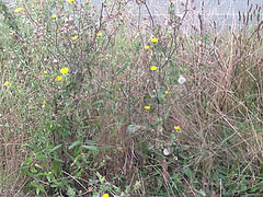
Before I went out and took these photos I had to decide what I wanted to achieve from them, I thought that if I could take images that had an obvious pigment of colour difference then the photo would look a lot brighter or darker depending on what colour stood out, and that you would have a focus point within the image. In these examples you can see how I have selected a certain colour I wish to focus on and made sure that in the background or foreground there was different plain colours. I was also interesting in playing around with the focus and how having the background blurred can help to bring out the colours of the foreground.
I like the 4th image in particular because of the blur that’s in the image. There is a focus onto one of the leaves while the rest of the bonsai tree is blurred. I think the effect of this makes the viewer curious to what the other leaves look like. For example if the tree has been badly cared for and all of the other leaves are brown and dying out, however the main focus is on the one leaf that’s not got to that stage yet, and still looks fresh and healthy. This makes you think about the contrast between life and death, and how in one play there are aspects between them both. Going with the blur aspect, it makes the viewer think what else is in the picture, and if the rest of the leaves on the tree and dead, why are they dead? What else is around the tree to make it how it is? I like the colours that are in the image, because they are very different making them stand out, however with the blur in the image you don’t notice them as much as you would think.
Before I went out and took these photos I had to decide what I wanted to achieve from them, I thought that if I could take images that had an obvious pigment of colour difference then the photo would look a lot brighter or darker depending on what colour stood out, and that you would have a focus point within the image. In these examples you can see how I have selected a certain colour I wish to focus on and made sure that in the background or foreground there was different plain colours. I was also interesting in playing around with the focus and how having the background blurred can help to bring out the colours of the foreground.

|

|

|

|
|
