Project #2: Lost
This out come involves the viewing being lost when looking at my images, being confused at what they're looking at and wondering what is actually going on. This will be done by manipulating images and removing something from its context so that you a no longer able to capture a moment but divorce the 'subject' from the moment. After researching Adam Broomberg and Jeff Wall I thought that a good place to start was in old books/magazines/newspapers and remove a part of the image from the 'background' in the style of Adam Broomberg, then to recreate this part in the way that Jeff Wall recreates images. This would hopefully leave people looking at my images wondering what is actually going on.
Research: Adam Broomberg & Oliver Chanarin
|
Within the start of the video you see Adam Broomberg and Oliver Chanarin talking about their views on conceptual photography which I found rather interesting. I was also interested in their images which remain untitled due to this reason, they don't have a name and you don't know whats going on in the picture which I found bizarre.
|
|
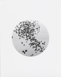
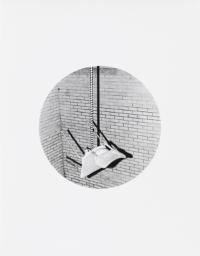
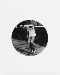
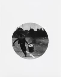
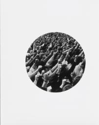
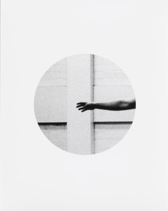
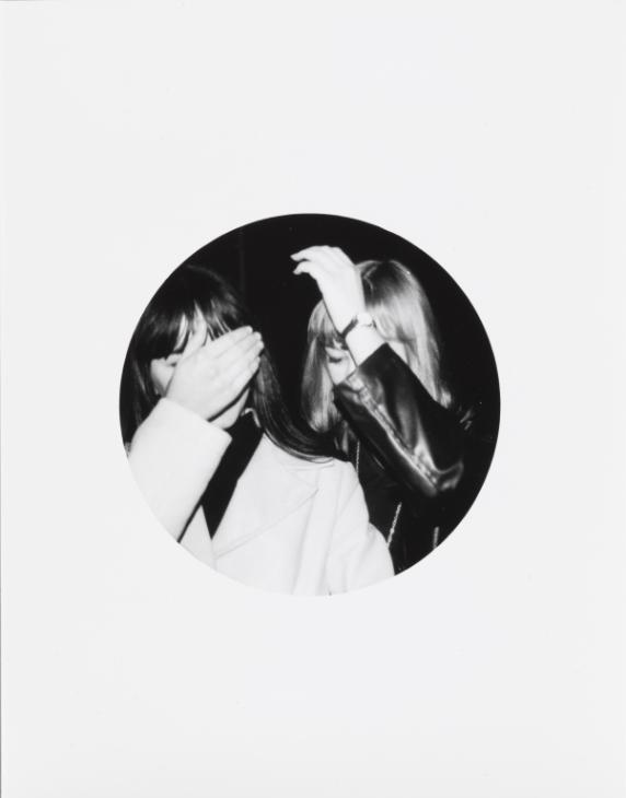
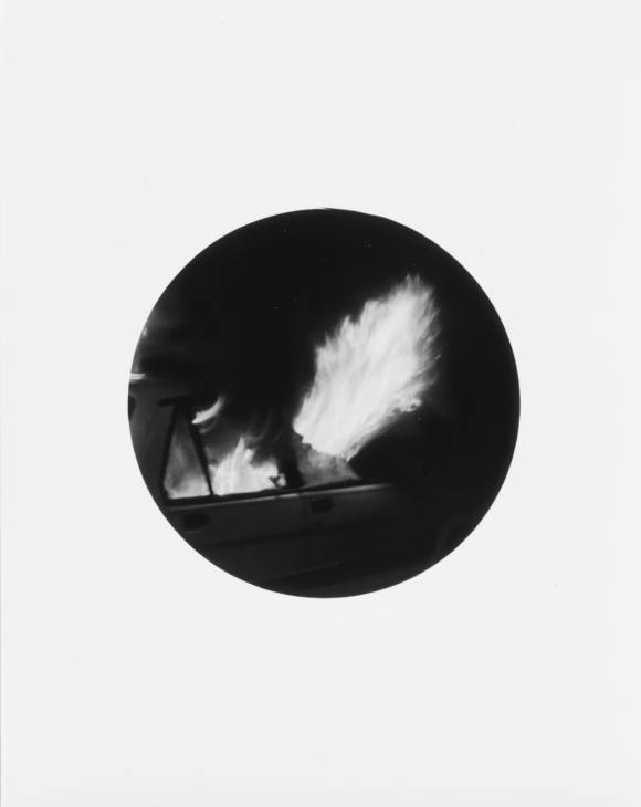
Photo shoot #1: Lost and Found
These images have been found in magazines, books and some are images that I got from online. I felt like these images fit perfectly for what the effect I wanted to achieve due to the composition of the original image
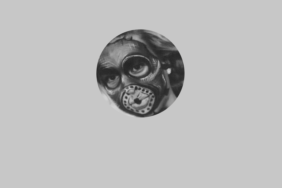

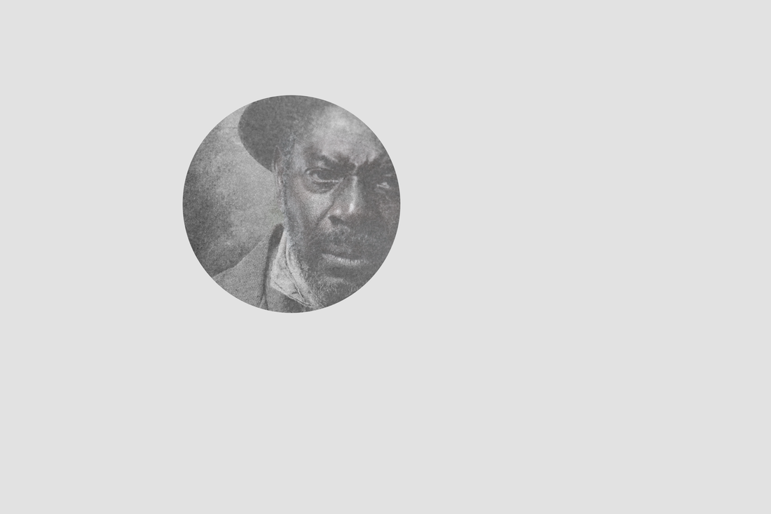
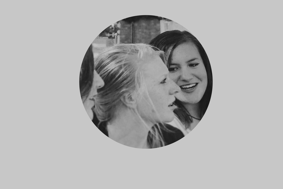
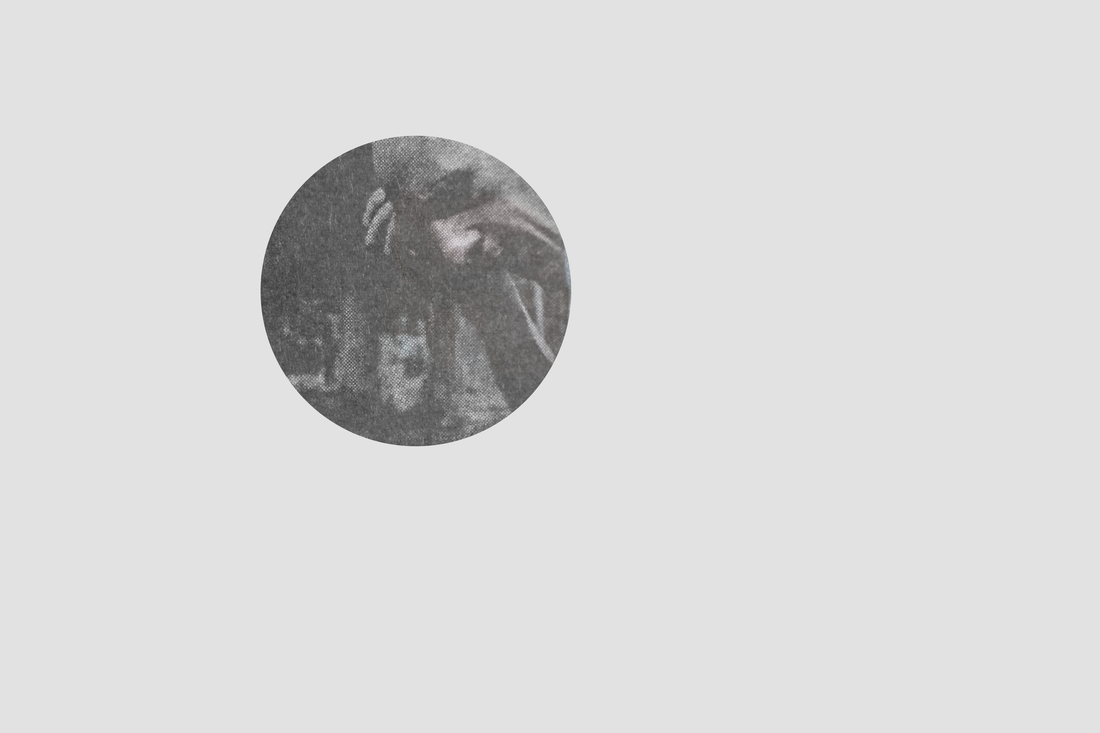
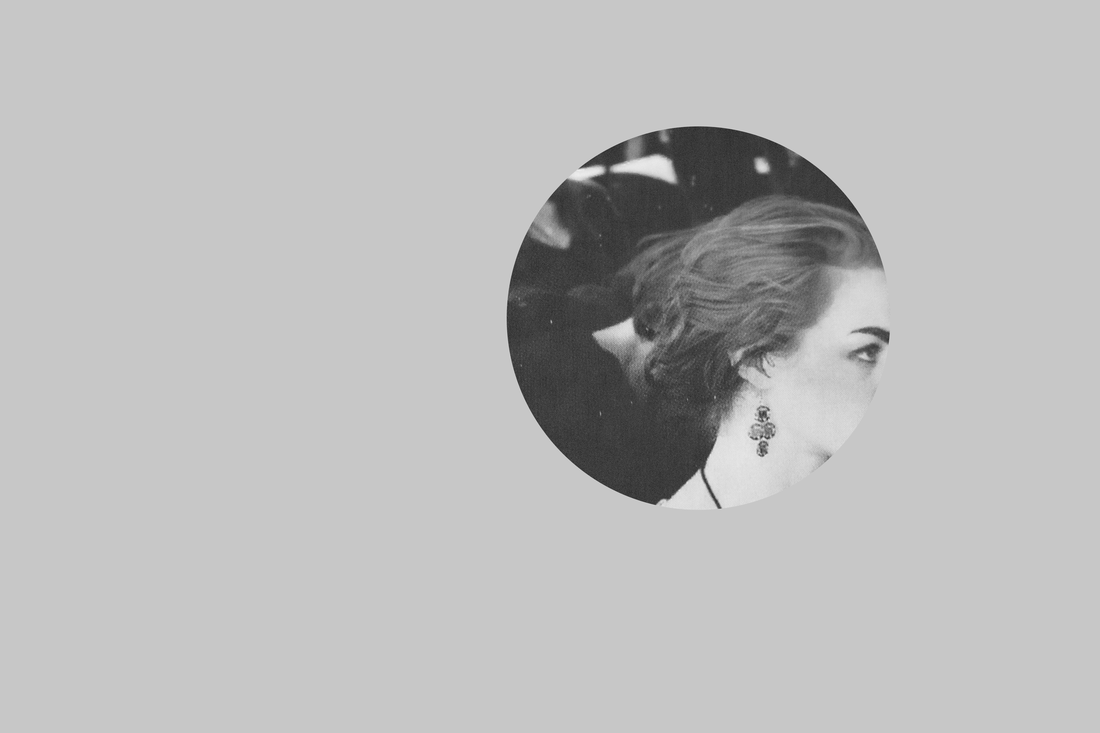
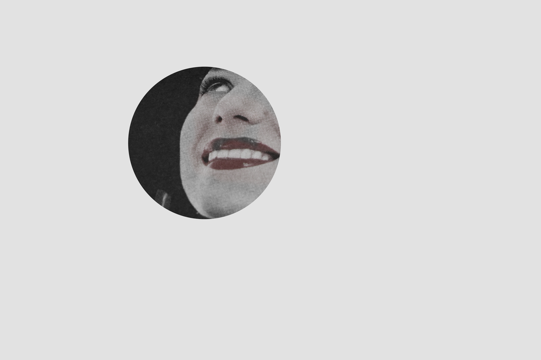
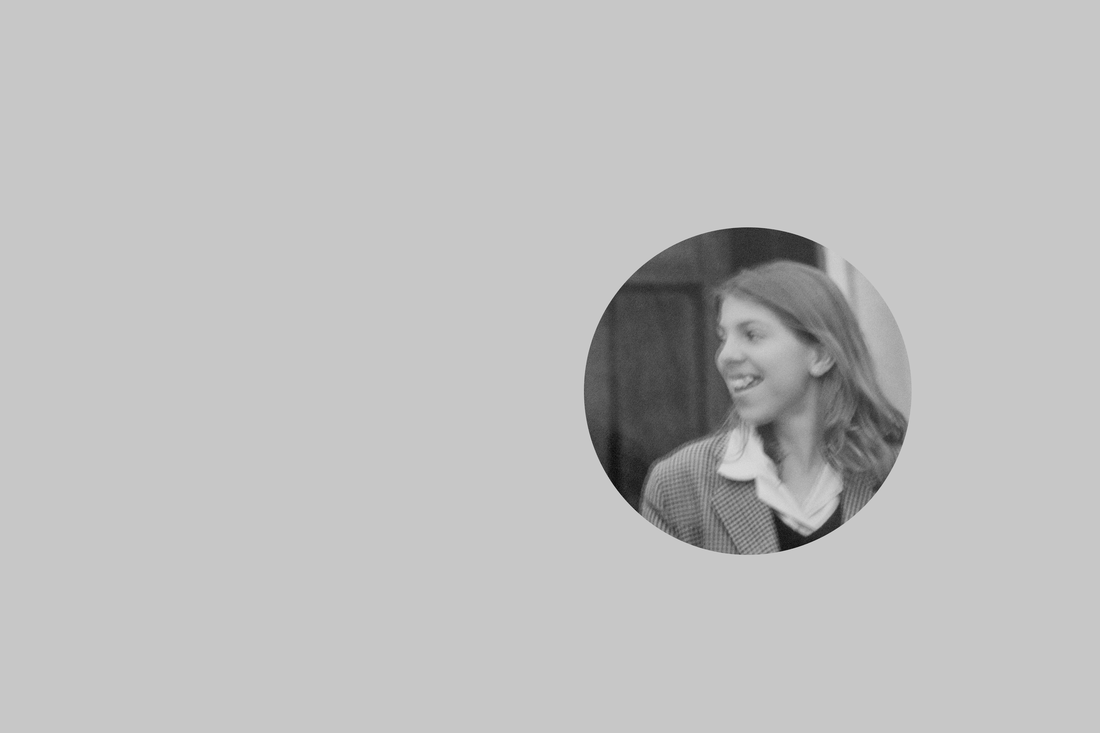

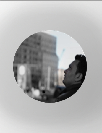
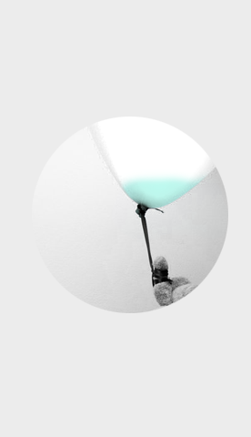
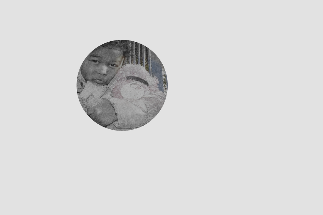
Photo shoot #2: Puzzled
The idea behind this was to add in the aspect of Jeff Wall, and create moments that I have either already seen and experienced, or to create something and see how it works with experimentation. I also tried to lay the images out as if there was a spiral making you a little more confused to what you already are when looking at the images that our out of context.

How I edited them
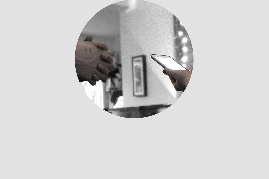
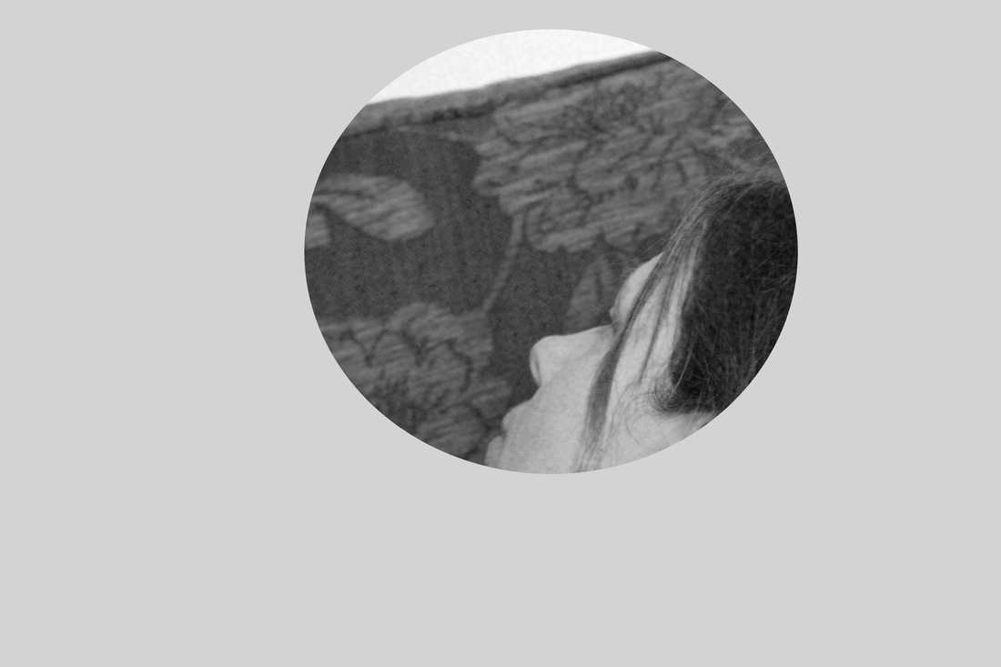
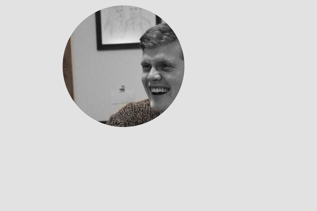
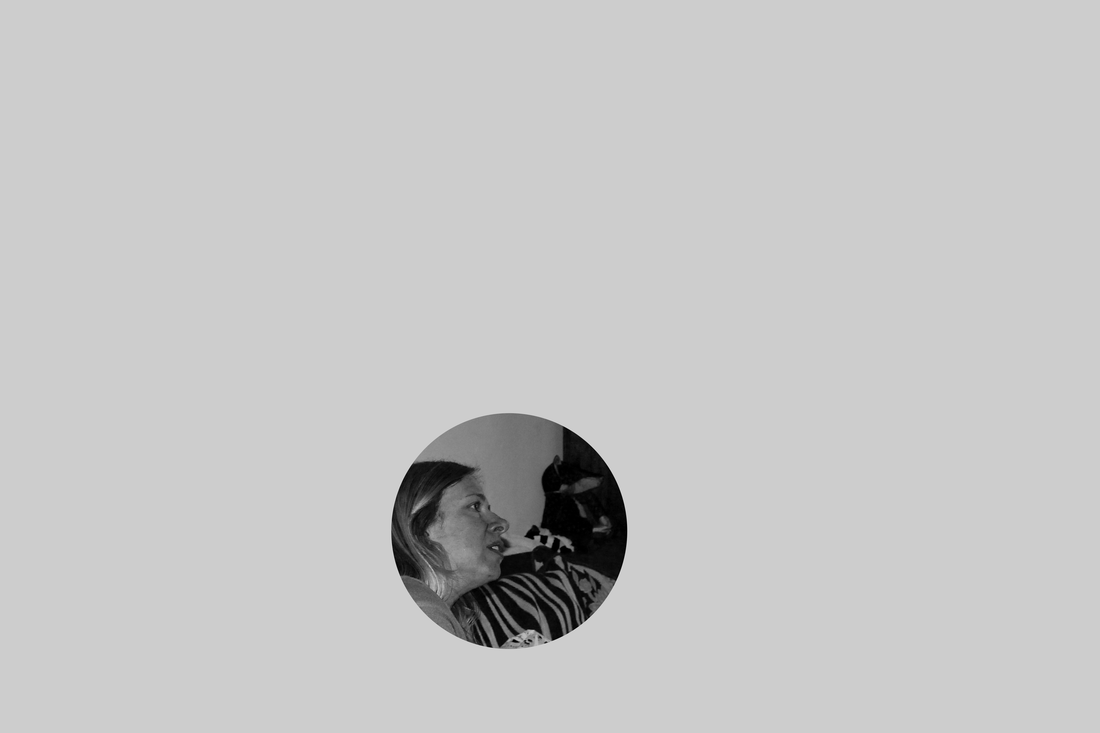
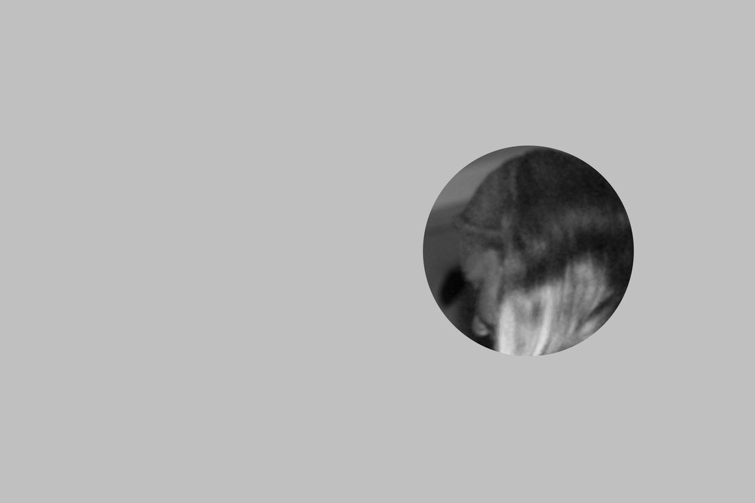
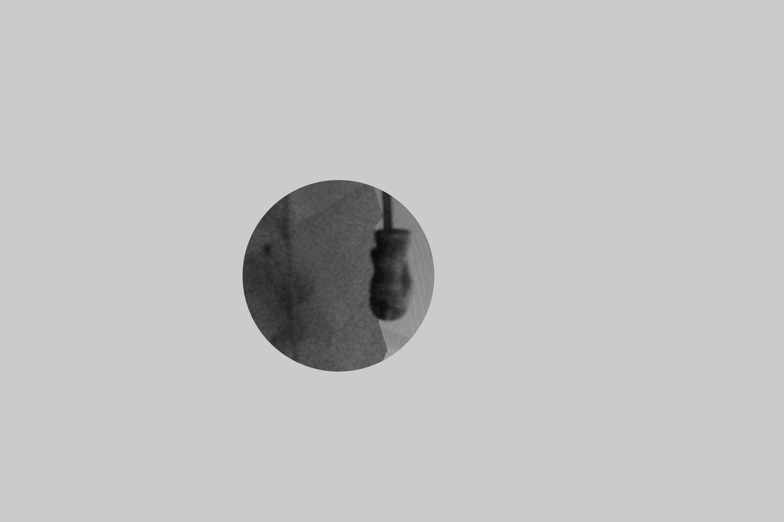
First of all I had to think of something I wanted to capture, a moment or a facial expression. I decided to go with a facial expression because you can't really tell if she is confused or if shes interested in something. So I stuck with the woman on the left.
|
|
I then added selected a colour that was a shade of grey, I didn't want to use white because white would of been too much of a bright colour, and in my research Broomberg didn't use white, it was toned down a little as his pictures were grainy. So I done the same.

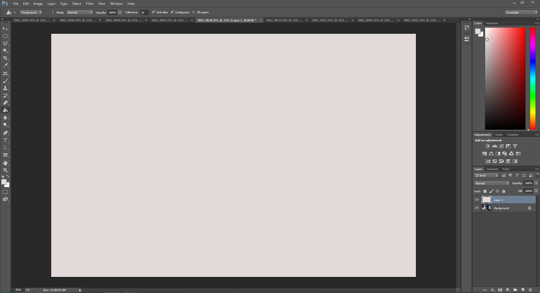
After this, I hid the grey layer so all I could see is the original image. This is so I can see what I'm working with meaning I can get just the right area instead of leaving it down to chance, and maybe getting something I don't want I used the elliptical marquee tool to select a designated area within the picture in this case it was the womans face.
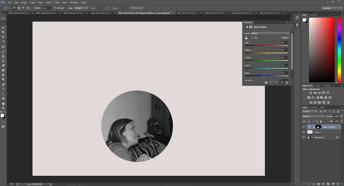
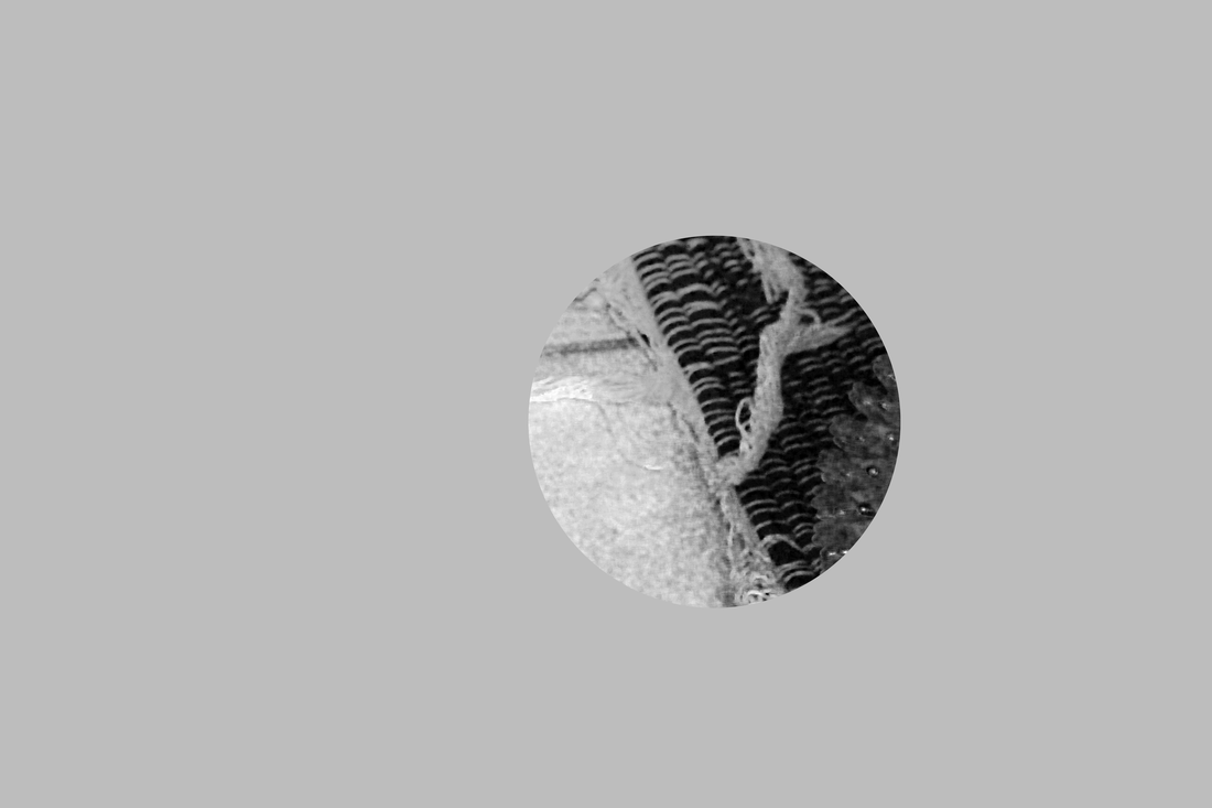
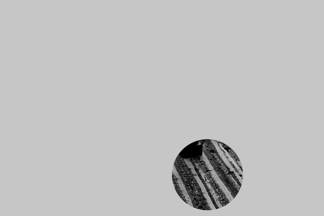
Once I was happy with the selection, I revealed the layer again and pressed Delete on the keyboard, removing the selected area leaving behind only a fragment of the image. I then made it black and white giving me another set of options. I experimented a lot with the black and white options, this is because I didn't want to use the default settings as there wasn't any originality and it still kept the image clear. I mainly changed the red and the yellows meaning the image came out grainy and patchy, just how I wanted them to be.
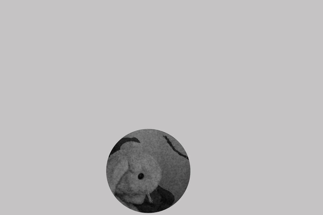
Photo shoot #3: Hints of colour
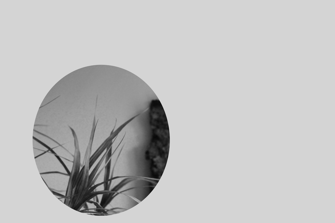
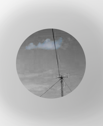
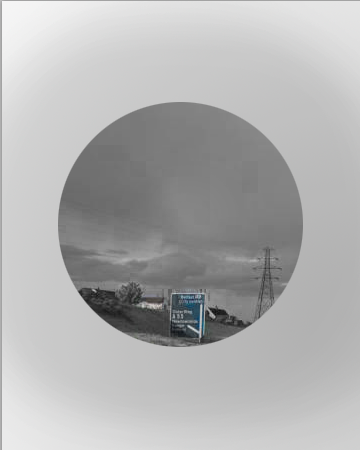
I further edited some images to show some hints of colour, some are more obvious than others however I felt like overall the colour helps to warm up the image and to draw your attention. I got the idea to add small sections of colour because when I first looked at Paul Grahams work the first thing I noticed was the distinctive blue sign which didn't fit with the image. So I wanted to take the effect of having one colour that draws your attention before you look at the rest of the image.


Evaluation
To conclude, I think that my final outcome worked out better than I thought it would. This is because when I actually printed my images they had a lot more blur and had a sort of retro feel to them, making them look older than what they are. However some of the images I have I felt were forced and not exactly needed there to present the effect I was going for. I stuck to my idea the whole way through meaning that I didn't have to readjust my images or anything. I stuck to a path and it was a lot smoother than the last project. Despite this if I was going to do this again I would present it the way I wanted to. I found it hard deciding on a way to present them, I noticed that there was a pattern on my website when I uploaded the images, making it look like there was a spiral in my images. I then thought that the way in which I can present them is by having all of them a spiral to help create the aspect of confusion. My main issue with this project was finding images that could have the context removed successfully in the way I wanted them to. If I was to do this again I would completely avoid using my own pictures, I would use other photographers images because people already know the meaning to those images, so if I removed the context to them people would be able to see this clearly.
My first idea for my second final piece was to take images around Lewisham, overhead of the Lewisham specific bins. This would mean that every bin would look the same as its from the top so all they would see is the blue rings and the content inside of the bin. The effect of this would mean that despite all of the images looking roughly the same with the content of the image they would actually all have something different inside so they would be individual images. This typology idea was inspired by Ed Ruschas Nine Swimming Pools and a Broken Glass. These images are of swimming pools from different angles mainly from above which makes them all look roughly the same, however the shapes to all of the images are different and vary which makes them all contrast. Finally there is an image of broken glass which doesn't fit at all in the image which I think is the main part to the contrast. This is because you see nine images of swimming pools and then a random broken glass. However the way that this image has been taken means that the colours that have been use almost make out like that broken glass and the water in the center of the image create a swimming pool of itself. I decided not to fulfill this idea as I felt like there wasn't really an idea behind it.
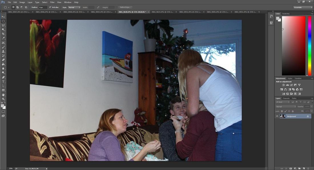
Before taking my main images I researched a variety of different photographers so I could see what it was that I wanted to do. I pictured myself removing the context thinking about the before and after and felt that I was then ready to experiment. I started off looking at books and magazines for images, taking pictures of something that only made sense when you could see the whole image. For example if there was a boy crying because he dropped his ice cream, if you only saw him crying you would assume something relatively serious happened to him. I ended up having some really successful images because there were a lot of different colours to them and different textures to the picture. I then asked some family members and friends to get into certain positions and pull certain positions inspired by Jeff Wall. These turned out well because when edited down you could clearly see their facial expression and the emotion to them.
I decided to put it on a grey background and make the pictures black and white to give it a retro effect making the pictures look like they were taken on an old school camera. This is because when doing research on Adam Broomberg his images look grainy and sometimes out of focus due to the loss of colour. Therefore I feel like I have achieved this effect well by editing them on Photoshop changing the intensity of colours and a variety of other effects. I also experimented with adding certain aspects of colour to it to see if it would draw your attention as soon as you looked at it. This was inspired by Paul Graham as in his images there's always one highlight to his images and so I tried to achieve the same effect. Some of the colours were really vibrant so I didn't want the full colour, I changed the opacity on that part of the image meaning the colour wasn't that strong meaning that the retro effect was maintained.
Overall I feel that my project achieved the effect I wanted, removing something from its context leaving the viewer confused and curious to what’s actually going on.
My first idea for my second final piece was to take images around Lewisham, overhead of the Lewisham specific bins. This would mean that every bin would look the same as its from the top so all they would see is the blue rings and the content inside of the bin. The effect of this would mean that despite all of the images looking roughly the same with the content of the image they would actually all have something different inside so they would be individual images. This typology idea was inspired by Ed Ruschas Nine Swimming Pools and a Broken Glass. These images are of swimming pools from different angles mainly from above which makes them all look roughly the same, however the shapes to all of the images are different and vary which makes them all contrast. Finally there is an image of broken glass which doesn't fit at all in the image which I think is the main part to the contrast. This is because you see nine images of swimming pools and then a random broken glass. However the way that this image has been taken means that the colours that have been use almost make out like that broken glass and the water in the center of the image create a swimming pool of itself. I decided not to fulfill this idea as I felt like there wasn't really an idea behind it.
Before taking my main images I researched a variety of different photographers so I could see what it was that I wanted to do. I pictured myself removing the context thinking about the before and after and felt that I was then ready to experiment. I started off looking at books and magazines for images, taking pictures of something that only made sense when you could see the whole image. For example if there was a boy crying because he dropped his ice cream, if you only saw him crying you would assume something relatively serious happened to him. I ended up having some really successful images because there were a lot of different colours to them and different textures to the picture. I then asked some family members and friends to get into certain positions and pull certain positions inspired by Jeff Wall. These turned out well because when edited down you could clearly see their facial expression and the emotion to them.
I decided to put it on a grey background and make the pictures black and white to give it a retro effect making the pictures look like they were taken on an old school camera. This is because when doing research on Adam Broomberg his images look grainy and sometimes out of focus due to the loss of colour. Therefore I feel like I have achieved this effect well by editing them on Photoshop changing the intensity of colours and a variety of other effects. I also experimented with adding certain aspects of colour to it to see if it would draw your attention as soon as you looked at it. This was inspired by Paul Graham as in his images there's always one highlight to his images and so I tried to achieve the same effect. Some of the colours were really vibrant so I didn't want the full colour, I changed the opacity on that part of the image meaning the colour wasn't that strong meaning that the retro effect was maintained.
Overall I feel that my project achieved the effect I wanted, removing something from its context leaving the viewer confused and curious to what’s actually going on.
Wild Ideas
My idea is the idea of not having an idea, therefore I want to make a video exaggerating the contrast between not having an idea and the idea being a visual thing that you are looking at. This will be done by having a clear facial expression as I cry, showing that the process of not having anything to do makes me cry. I could also add a voiceover or some text to make it clear on what’s going on. When looking at Bas Jan Aders work he films his videos in black and white which helps to bring out the emotion of things being dull, mundane and depressing as he crys. I will also make some stills from the video so there is something cut that you can look at and not just a video. The effect of the video is an ironic statement to me as its embarrassing, leaving it open to the viewer as to whether or not to take on the embarrassment, forcing them to feel a variety of different emotions. Aders created a video called ‘Im too sad to tell you’ which he then made several photographs (long hair and short hair versions) and a postcard which he mailed to his friends with the inscription "I'm too sad to tell you".
Research
|
|
Bas Jan AderIn the start of Aders videos he has a bit of text that tells you what his name is, and what the title of the project is. This is helpful for understanding what is going on in the video so it isn't just a plain bit of footage there is some sense to it.
|
